Lore
Nerdin’ Out with Responsive Design
I’m gonna out myself as a nerd here for just a second, so bear with me. I love responsive design. It’s such a cool concept to me that you can write the HTML for a website and code your CSS to make the site respond for different screen sizes. And with the use of CSS frameworks like Foundation and Bootstrap, they make this process so much simpler.
Here are some tips I’d love to share from my experience:
1. Browser Dev tools are your best friend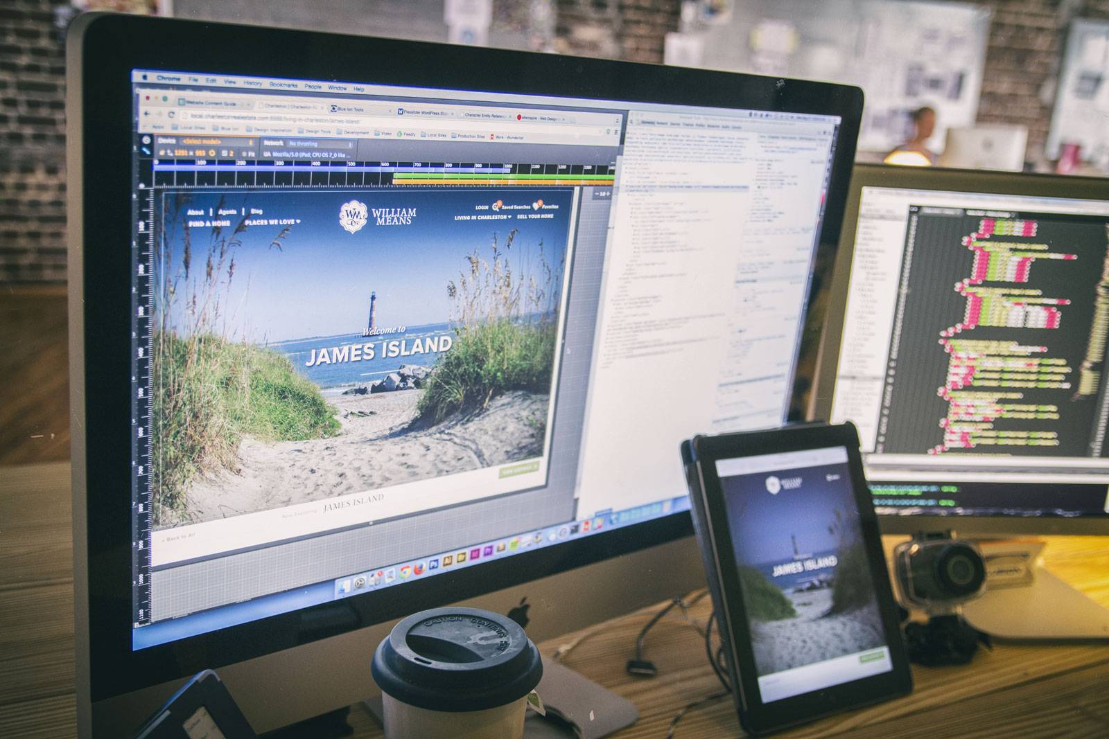
Chrome happens to be my browser of choice during development, but regardless of which one you choose, there are numerous tools out there to help you dig into your code. Chrome has a device emulator built in so you can change the screen to various widths for testing. You can also “Inspect Element” on objects on the page and you can edit the CSS to fine tune the design right in the browser.
2. Actually use real devices
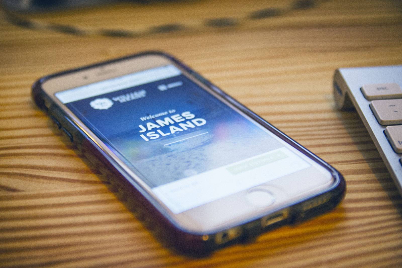
You don’t need to go crazy and have a million devices in front of you, but it’s a great idea to have a mobile device or a tablet on hand to test how the text reads and how the the buttons size up for tapping. I usually have my iPhone and iPad pulled up in front of me and I refresh like a mad man to test all the subtle nuances in the different screen sizes. I also like to pull out my Macbook Pro to see how it feels on a standard laptop screen because, if you’re like me, you’re working on a mega monitor and my designs can get a little large because I have so much real estate.
3. Have fun with it!
Technology is fun! It can be a hassle at times, but it’s such a fun time for tech nerds because we get to build things that are accessible. If you’re stumped on how to handle certain parts of a site and how they respond, chances are a hundred other people have run into that issue before and can offer solutions on how to handle them.
Feel free to email me if you have any questions [ [email protected] ], I’d be happy to help with any more specific issues you’re facing.
Happy coding!